Pictlink
Pictlink is a platform that lets users view, share, and interact with photos from purikura (プリクラ) (photo sticker booths) while also offering booth reviews.
My Role
UI & Design System Designer
Platforms
Mobile
Timeline
Feb 2018 - Feb 2019
Tools Used
Sketch, Zeplin
Background Information
Solving Design Chaos in Pictlink
When I was first introduced to Pictlink as a contractor designer, the application was cluttered with a myriad of random design components. The absence of a cohesive design system was a significant problem, negatively affecting not only the app's visual appeal but also complicating the tasks of developers and designers. My task was to streamline this chaos and create an efficient design system.
Issue Summary
Stating the Problem
“With Pictlink’s website being in use for an extended period, it lacked a unified design language causing a poor user experience. Also, the inconsistency slowed down the engineers’ work, creating uncertainty about which design elements to utilize for updates. ”
Challenge
Overcoming Component Overload
Initially, Pictlink's design consisted of over hundred random components. This lack of a unified design language resulted in confusion even over basic elements like buttons, which were inconsistently designed despite having similar functions. Another significant challenge was to get the in-house designers accustomed to and on-board with the proposed design alterations.
Strategy
Conducting Design Audit & Implementing Component-Based Design System
My approach was to conduct an audit of the existing design components, categorizing
what was necessary
what was redundant
what could be simplified or standardized
The main goal was to eliminate inconsistencies through developing a unified, component-based design system which could be seamlessly implemented across the service.
(As demonstrated in the image below) All existing pages were listed, necessary components were defined, and any unneeded parts were removed
Component-Based Design: A Closer Look
A component-based design system breaks down the user interface into smaller, easily manageable parts, each with a distinct name. These parts are then classified into one of six unique groups.
1) Brand Identity Elements
Defined the colors, typography and typefaces
Below is an example of color guidelines
2) Standing-alone Elements
Created the smallest reusable elements of the website, such as buttons, input fields, icons
Below is an example of icon & button elements
3) Components
Created components that consists of stand-alone elements like the photo booth description component, ranking component
Below is an example of components like header, booth card and article card
4) Compositions
Created compositions, which include multiple components within them
Below is an example of compositions like topic list and present list
5) Layout
Defined the amounts of white-space, paddings and margins
Below is an example of margins & padding
6) Pages
Designed the actual pages of the website
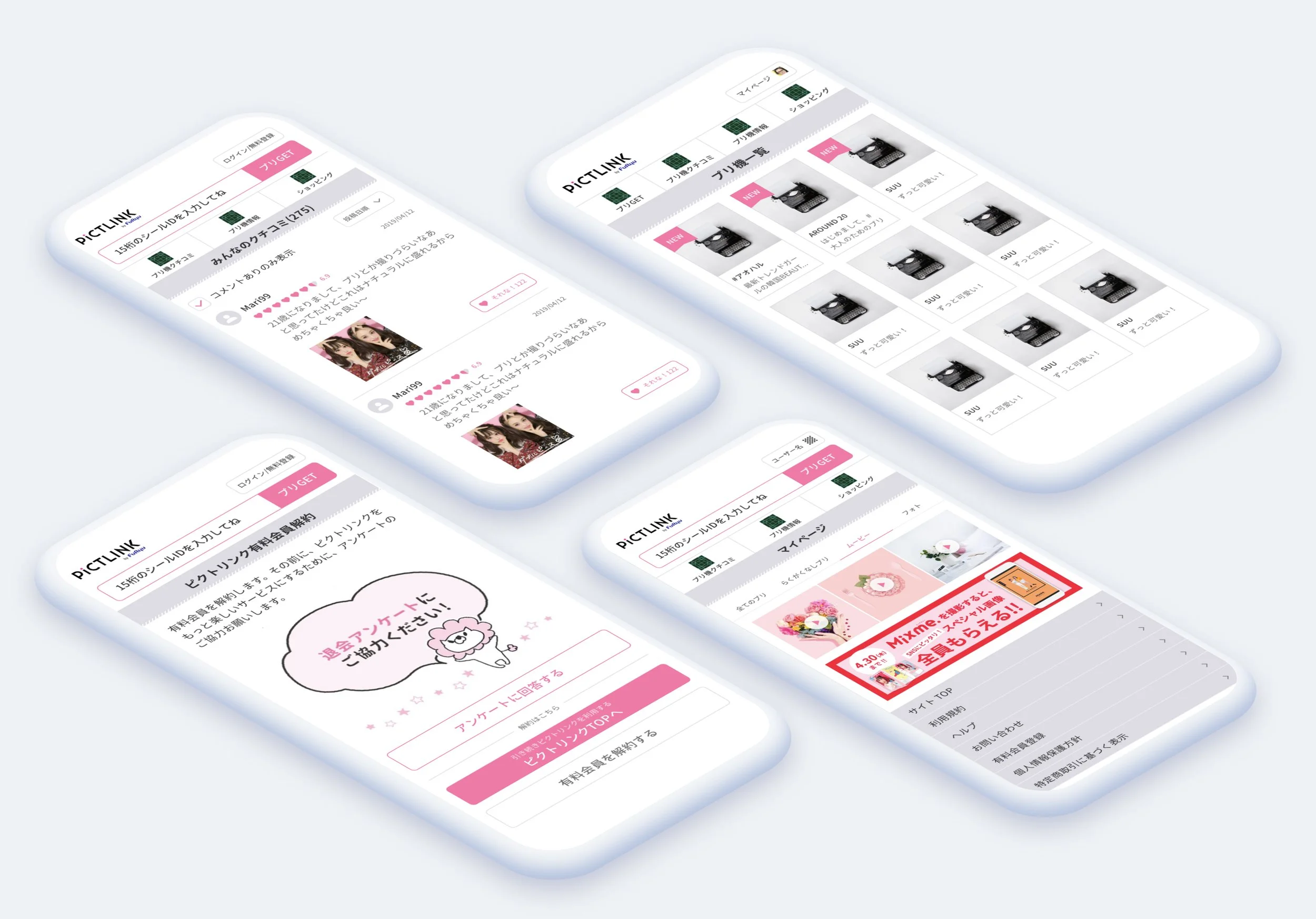
Below are some examples of what the screens look like after we finalized the design system and implemented it
Outcomes & Learnings
The Power of Unified Design System
The impact of the new design system was immediate. It not only increased the efficiency of the design and development process but also significantly improved the app's aesthetics. The unification of components under a single system allowed developers to work with a clear understanding of design principles, enhancing the overall user experience of the Pictlink.Reflecting on this project, I realized the profound impact a well-structured, component-based design system can have on a digital platform like Pictlink. By bringing standardization and clarity, it simplified team collaboration and improved the end-user experience significantly. The success of this project has been paramount in shaping my perspective towards the power of strategic design thinking and its lasting impact.

